Webデザインにおいて、テキストの装飾を適切に設定することは、ユーザビリティや視認性に大きな影響を与えます。本記事では、CSSのtext-decorationプロパティの基本から、実践的な使い方までを解説します。
Contents
text-decorationの基本
text-decorationプロパティは、テキストに下線・取り消し線・オーバーラインなどの装飾を適用するためのCSSプロパティです。以下のような値を指定できます。
キーワード値
text-decorationには以下のキーワード値を使用できます。
p {
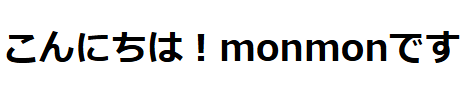
text-decoration: none; /* 装飾なし(デフォルト) */
}
p {
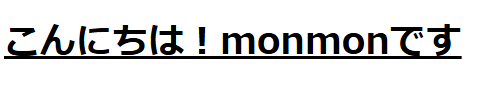
text-decoration: underline; /* 下線 */
}
p {
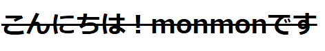
text-decoration: line-through; /* 取り消し線 */
}
p {
text-decoration: overline; /* 上線 */
}none: 装飾なし
underline: 下線
line-through: 取り消し線(打ち消し線)
overline: 上線
text-decorationの応用
リンクの下線をカスタマイズする
デフォルトでは、<a>タグには下線が適用されていますが、以下のように変更できます。
a {
  text-decoration: none; /* 下線を削除 */
}
下線を残しつつ、スタイルをカスタマイズすることも可能です。
a {
  text-decoration: underline dashed; /* 破線の下線 */
}
text-decoration-colorで色を変更
text-decoration-colorを使うと、装飾の色を変更できます。
h1 {
  text-decoration: underline;
  text-decoration-color: red;
}
text-decoration-thicknessで線の太さを変更
text-decoration-thicknessを使うことで、下線や取り消し線の太さを調整できます。
p {
  text-decoration: underline;
  text-decoration-thickness: 3px;
}
text-decoration-styleでスタイルを変更
text-decoration-styleを使用すると、線のスタイルを変更できます。
p {
  text-decoration: underline;
  text-decoration-style: wavy; /* 波線 */
}詳しいスタイルについてはこちらへ
text-decorationをショートハンドで指定
text-decorationは、複数のプロパティを一括で設定できます。
p {
  text-decoration: underline wavy blue 2px;
}
この例では、青色の波線を2pxの太さで適用しています。
まとめ
text-decorationを活用することで、テキストの装飾を柔軟にコントロールできます。特にtext-decoration-colorやtext-decoration-styleを組み合わせることで、デザインの幅を広げることができます。適切な装飾を選び、可読性とデザインのバランスを意識しましょう!
コメント